Get your own images printed
Hello there fellow photographer! Of course, most of photography these days is digital – thank God I may add. But it could still be nice to get your hands on a beautiful print of your favorite image on high quality paper. “Easy” I thought – and had to learn how to prepare my image for this. In this blogpost you can tag along on my journey from digital to print with the use of Lightroom.
Introduction
Printing your own image cannot be to hard – right? Right! You could just hit “print” in your image software and let your printer do the job.
There is a chance that the colors and the brightness of your printed image look somewhat different than what it looked like on your screen. For many uses this works just fine.
However, I wanted to take it a step further. I wanted a larger print than my own printer could handle, and on something better than glossy photo paper you buy at your convenience store. And so, I considered sending it to a printing lab, which is what I did for one of my favorite images. I had to learn a way how to prepare my digital images for print – and it worked out for me. Maybe my experience helps you to get started with prints yourself!
My Workflow from Digital Image to Print
The easiest way would probably be to just upload the image to any printing service, tick something like an “auto optimize” checkbox – which most labs offer – and submit your order. Perfectly fine and valid way to go. However, this may lead to results which are not quite what you were looking for. This is why I chose to take it a step further.
Here is my workflow how I will get prints in the future. As you will see further below, I had to try a few different things to get there.
from Digital to Print
- Select your image
- Make sure your monitor is freshly calibrated
- Do you have the color profile from your print services installed?
- With Lightroom’s soft proofing feature, adjust your image to make it look correct after print
- Order a test print – take your time evaluating it
- Make any necessary adjustments and order your final product
How I found my Way from Digital Image to Print
Let me give you a short rundown of what I did to get my final print just like I wanted it to be. The details of the process, more background, and technical how-to can be found further below.
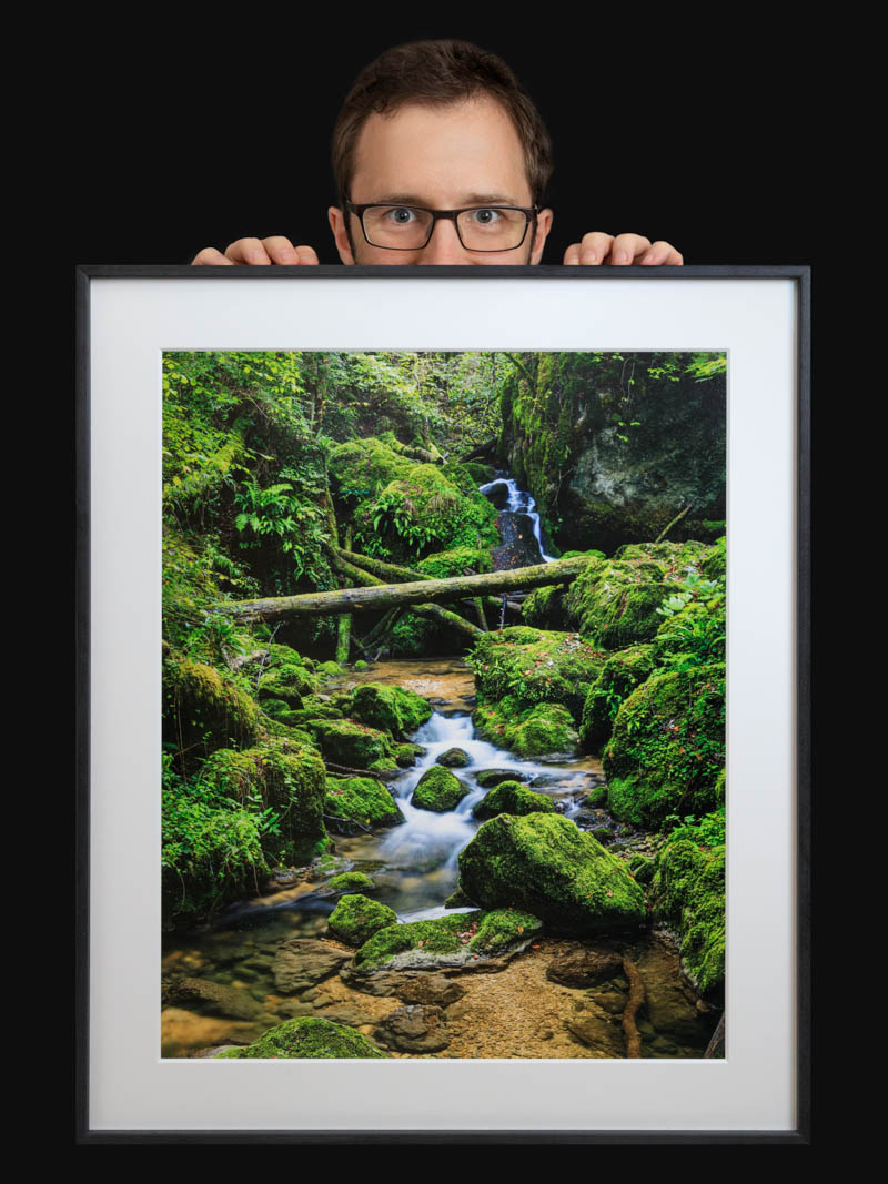
It may seem obvious, but of course you need to select your image first. Most cameras these days create high enough resolution images for small prints. But if you want to go bigger, then you may need an image with some extra resolution.
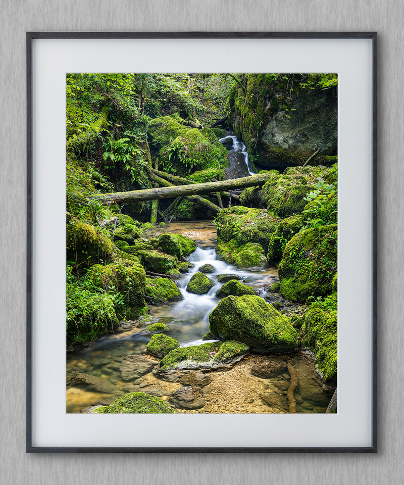
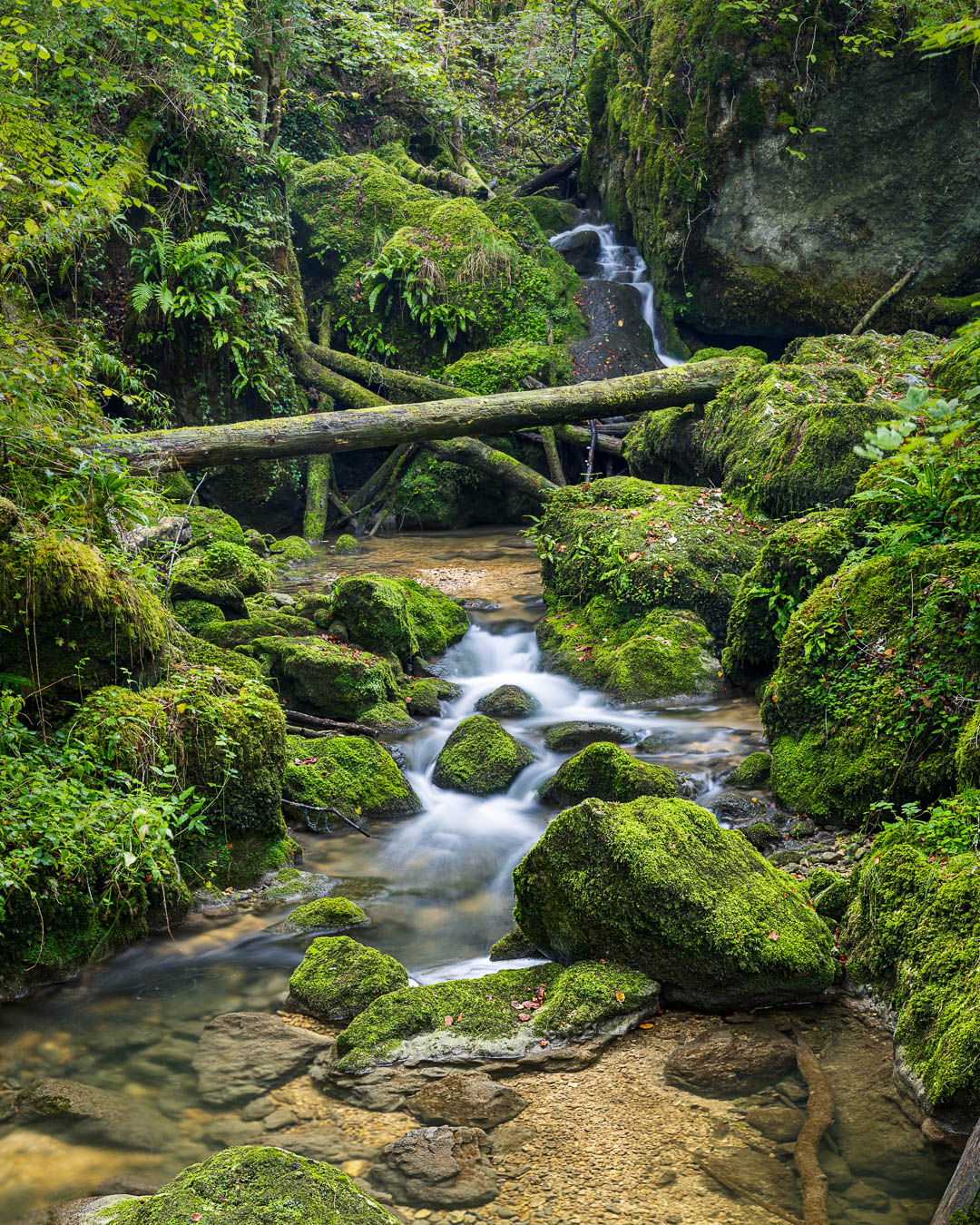
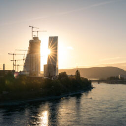
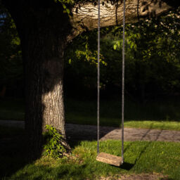
The image I had in mind should be fine in this regard, you can take a look at it in higher resolution in my portfolio.
I was a bit unsure how to find the right provider. After looking through several services, I ended up choosing Whitewall, a Germany based company.
Not only do they deliver to Switzerland, they also offer test prints and ICC color profiles – which is awesome if you don’t have any experience with prints and different materials. Just download the color profile files which are relevant to your print and install them. More details further below.
To be clear: I have no connection to the company other than using their services. It just happens to be the one I picked for my first try.
Preparing for Test Prints
If you want go down the road of trying to control your colors, then in my opinion a calibrated monitor is a “must”.
Next, you want to prepare a corrected image file for each media you plan to print on. Just like different monitors can show colors differently, the paper you are printing on influences how the printed colors look like. A color profile takes both the paper, the printer, and the used ink into account.
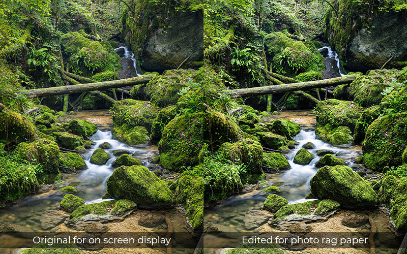
Since I had no experience at all with different printing materials, I wanted to test 4 papers. For me, this meant I had to prepare 4 different version of my original image to adjust for those materials. Lightroom’s “soft proof” feature together with the installed color profiles was particularly useful for this.
If you export those images and look at them on screen, they may look quite horrible. But printed they should be close to what your original image looked like.
Evaluating Testprints
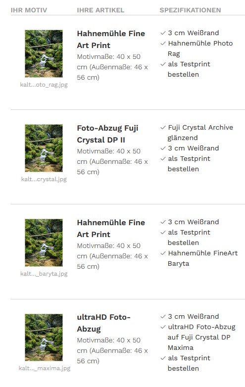
I sent the 4 files off to Whitewall and got my test prints a couple of days later. This allowed me to select the paper which suited my needs the best.
The “Hahnemühle Photo Rag” had a nice structure, the colors and the muted blacks gave it kind of an “old picture” vibe. Interesting, but not the right thing for this particular image.
The print on “Fuji Crystal Archive” looked fine, very similar to the UltraHD print on “Fuji Crystal DP Maxima”. Interestingly the latter really showed more details if you looked very closely. But the gloss of these two papers was too strong for me. I was afraid that I would only be looking at reflections from nearby windows. But in the future, if I was to get an image behind acrylic, I would consider the latter one for it.
Finally, the “Hahnemühle FineArt Baryta” stood out the most: Very vivid colors, deep blacks, a fine gloss, and a beautiful structure. Since I was considering getting it framed, this was the best choice for me.
But test prints are not only a means to select the right paper. I put the chosen test print into my office where I would look at it fairly often over a number of weeks.
After I while I noticed a couple of small issues which bothered me. Those I could edit out easily in post processing. Maybe you can spot the changes in the final result below?
The Final Product
Once this was done, all that was left was to order my final print which arrived only a couple of days later. I am super happy with the result 😀. Going through this whole process really paid out for me – and it was certainly not the last time I printed one of my images.
At first, I considered getting my image framed at Whitewall, but in the end chose to go to a local store instead. The owner of Einrahmugen Kunz did a fantastic job helping me selecting the right frame for this image. She showed me different frame samples and so I could compare them side by side which was very helpful. And the effect of different glass qualities was most impressive. Gallery quality glass produces hardly any reflections and does not alter the color and brightness of the underlying image. So of course, after going all the way with the print, I was more than happy to pay a premium for it.
How do you like it? Let me know down below in the comments.
If I sparked your interest, you can find more in-depth information below. Keep in mind that I am no expert in the matter, so all to the best of my knowledge.
Image to Print – in More Detail
In this last section, I am going more into technical detail and elaborate a bit more what this is all about. Keep reading if you want to know more, or if you are looking for some specific details you were missing above.
Image Quality
Most cameras these days create high enough resolution images for small prints. But if you want to go bigger, then you may need an image with some extra resolution.
In my case, the image is a vertical panorama comprised of three original photographs and a final resolution of 6600 * 8250 pixels. These more than 50 megapixels are enough for a larger print – in my case I chose 40 x 50 cm.
Interestingly, a print on this scale on Hanemühle Baryta Paper does not show all the details of the original image. This suggests I could go even larger with this particular one. Choosing a “Ultra-HD Print” indeed lead to more details in the final result, but the paper used for this print was not suitable for my needs.
You may think: what about my own image? Is it large enough? Alas, I cannot give you a hard number of pixels for a certain size, it will depend on your medium and print. But most services give you a warning if your image is too small. The provider I chose just simply hides the too large formats if your image does not have the needed pixel count. For the image in this case, it would let me choose up to 80 x 100 cm on fine art paper.
Your Screen Matters
Did you ever notice that images can look different depending on the computer screen you look at them? For instance, you post an image on social media which looks great to you on your phone, but then later when you look at it again on your computer the colors have shifted? One reason for this may be that these screens render the same color information differently. And of course, we cannot have this if we want to make sure our printed image looks the same as how we see it on screen.
To get around this issue you will have to calibrate your monitor 😱 Don’t panic, it’s not that big of a deal 🙂! You can of course skip this step, but you may experience differences in color between print and what you see on your screen.
I’ll show you how I do it on my computer. Mind you, I don’t have any connection to the companies of the products I mention. It just happens to be what I use. There are other and certainly better options available.
Many years ago, I bought a DataColor Spyder 5 along with some accessories for color management of my photographs. By now there must be newer models available, but it still does its job for me. It’s very simple to set up: download the software on their webpage, plug in the calibration device and follow the step-by-step instructions.
The only part which I struggled with was to decide to what white point and brightness to choose. In my first run the software suggested some values which threw the whole thing completely off (suggestions were different from what is shown below). I had to dig a bit in the depth of the internet and decided to go with the following settings.
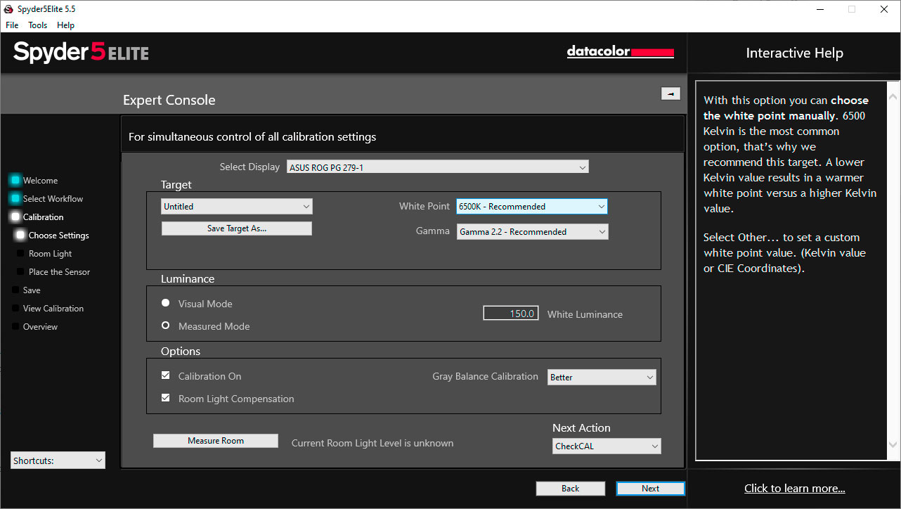
The right brightness will depend on your screen and your environment. But it seems the 6500K white point is most common and helps to make sure your images look about right for most people.
Once you followed all the steps for calibration, you can save the color profile and you should be good to go. At every start of your computer, this profile is loaded and ensures the colors on your screen are correct. Make sure to recalibrate every once in a while.
With this your computer screen is set – on to the next parts!
Thoughts on Printing Service Selection
Next let’s talk about the decision where to get your photograph printed. Living in Switzerland I was looking for options available here. If not the exact same company, at least some with similar options should be available in your place.
Again, I have no connections whatsoever with the companies I mention below, it’s just where I ended up and what worked for me.
After looking through several print providers, I ended up at Whitewall, a Germany based company. Apart from the fact that their website appears professional, the following points swayed me to take my chances with them:
- A whole variety of aspect ratios – others were much more limited
- Various Media
- Color profiles for their papers are provided
- You can get relatively cheap test prints
While everything counts, the last point was important to me. Remember this is the first time I was trying this. So, to have the option to get test prints was not only important to make sure my colors were exactly the way I wanted, but also, I could try out different papers and see how they look and feel.
ICC Color Profile
Now, why would you want to use a color profile for print? The paper you are printing on influences how the colors look once printed. After all, it has a color of its own – which is by no means just neutral. The material may also have an impact on how “glossy” the image appears. A color profile takes both the paper, the printer, and the used ink into account.
The idea is, to change your image in such a way, that it looks exactly like on screen when printed.
The idea is now, to change the image in such a way, that the printed result looks just the way your original image looks like on screen. If parts of your image look too dark after printing you have to brighten them. Some colors may look desaturated, and so you counter with more saturation. The paper may introduce excessive warmth, and so a slight change in white balance might help.
Lightroom will use this color profile to simulate how your image looks like after print – and with this helps you to make these necessary adjustments.
Depending on your image and the paper chosen, it may indeed be impossible to render the image exactly like on your screen. Maybe it is near impossible to get very dark blacks – or the dynamic range of your image can simply not be rendered by the paper and the inks used for printing.
So, picking a paper which suits your image is key!
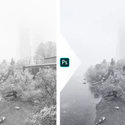
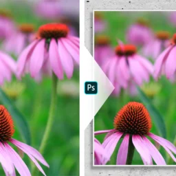
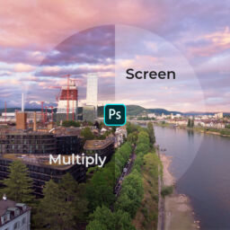
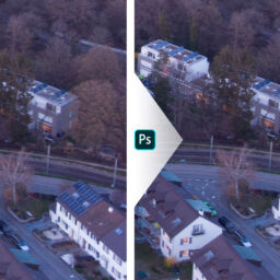
The comparison above demonstrates how an image may have to be changed for it to look right when printed. Notice on the right how the contrast is much higher, the shadows are darkened a lot and the overall saturation changes.
In this particular case, the chosen paper does not really fit well with the image. I tried to get as close as possible, but the printed image did not match the original completely.
In the next section, you’ll find a guide on how to best do those adaptations in Lightroom Classic.
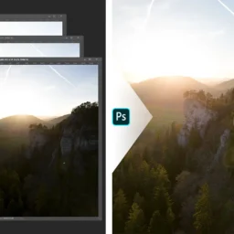
Prepare your digital image for Print – Soft Proof in Lightroom
So how do we edit our image, so it looks right when printed? Lightroom Classic has a feature called “Soft Proof”, which is just what we need. Julieanne Kost from Adobe has a video up, which explains how to do this in a very short and helpful way. Make sure to use the appropriate ICC color profile!
Export your image for submission to your print service
Once you are done with all your edits in soft-proof all that is left is to export your image to be submitted to a print service. This is no big deal, but I made sure to embed the color profile used above. A print service which offers its own color profiles will of course properly use them.
Final thoughts
This whole process was a good learning journey for me, bringing my print to an acceptable level. Thanks for reading the whole way through, I hope you found some inspiration for yourself. If you have some experience yourself or have questions, please share down below in the comments.
Thanks for Reading Through the Whole Blogpost!
I hope it proves useful and you can take something with you. Let me know below if you have any questions, comments, or suggestions.
Danke Theodor für den ausführlichen Blogpost. Ich habe den Schaffensprozess ja von Anfang an miterlebt und habe über die unterschiedlichen Prints von Whitewall gestaunt und die Tatsache, was nur schon das Papier für einen grossen Einfluss auf das Ergebnis hat.
Wenn es einem sehr wichtig ist, wie das eigene Bild nach dem Druck aussieht, kommt man um die von dir beschriebene Vorgehensweise wohl nicht herum.
Du bringst alle wichtigen Aspekte auf den Punkt und mit deiner Anleitung werde ich das demnächst mit ein paar von meinen Bildern auch versuchen.
Liebe Grüsse, Nadia
Danke dir viel mals Nadia! Ich war selbst auch überrascht was die Vorbereitung und das richtige Papier ausmachen kann. Ist halt nicht das gleiche darüber zu lesen oder es selbst zu erleben. 🤷♂️
Auf jeden Fall hoffe ich, dass die Anleitung hilft und du deine Prints genauso hinkriegst wie du sie haben willst.